Category 5 Hurricane Ivan hit the Gulf Coast near the Florida Panhandle and Alabama. It hit on the night of September 15th/early morning of September 16th 2004. It brought tremendous rain and severe rain damage to the Gulf Coast. Hurricane Ivan reached 123 fatalities ranging from the Carribeans all the way to the US's Gulf Coast. The storm reached 165 MPH winds. This storm was traumatic because a lot of these places had been recently affected by past hurricanes. It caused a lot of damage and took a long time for people to recover from it. This video was very interesting to watch as it showed news footage and some live footage as the hurricane slammed Pensacola, FL.
Thursday, September 20, 2012
Category 5 Hurricane Ivan hit the Gulf Coast near the Florida Panhandle and Alabama. It hit on the night of September 15th/early morning of September 16th 2004. It brought tremendous rain and severe rain damage to the Gulf Coast. Hurricane Ivan reached 123 fatalities ranging from the Carribeans all the way to the US's Gulf Coast. The storm reached 165 MPH winds. This storm was traumatic because a lot of these places had been recently affected by past hurricanes. It caused a lot of damage and took a long time for people to recover from it. This video was very interesting to watch as it showed news footage and some live footage as the hurricane slammed Pensacola, FL.
Thursday, September 6, 2012
Proportional Symbol Map
Proportional Symbol Map

This map is a Proportional Symbol Map that shows the density of a certain subject, in this case, amount of Walmarts across the United States. This map uses dots of different sizes to show the number of Walmarts. The small dots represent 1 Walmart while the biggest one represents 100 dots. This map is very easy to read and understand.
This map is a Proportional Symbol Map that shows the density of a certain subject, in this case, amount of Walmarts across the United States. This map uses dots of different sizes to show the number of Walmarts. The small dots represent 1 Walmart while the biggest one represents 100 dots. This map is very easy to read and understand.
Bathymetric Map
Bathymetric Map
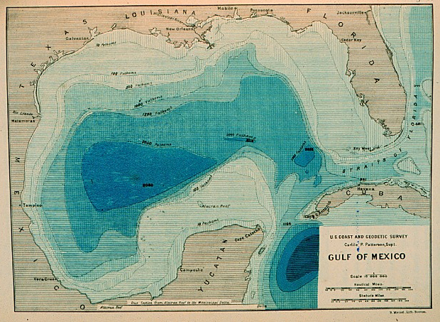
This map is a Bathymetric map and it is very similar to a Topographic map but the difference is it for water. Bathymetric Maps show the depth and different elevations of water. These maps are very important to show people the different levels of water and where the changes occur. In this particular map, the white color is very shallow water and as the blue color gets darker, the water level gets deeper.
This map is a Bathymetric map and it is very similar to a Topographic map but the difference is it for water. Bathymetric Maps show the depth and different elevations of water. These maps are very important to show people the different levels of water and where the changes occur. In this particular map, the white color is very shallow water and as the blue color gets darker, the water level gets deeper.
Isopleth Map

This particular map is an Isopleth map that uses contour lines to show regions of equal value on a line. This map shows the levels of pH across the United States and the level of sensitivity. The legend shows that the red colored areas are "sensitive" and the purple areas are "extremely sensitive." The lines are areas with a certain pH level.
Dot Density Map
Dot Density Map showing population in the US.
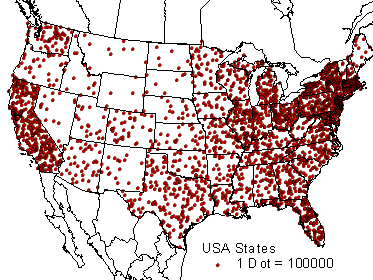
This map is called a Dot Density Map that consists of dots to show the density of the of the Population. This type of map can represent anything. This map shows that each dot equals 100,000 people.
This map is called a Dot Density Map that consists of dots to show the density of the of the Population. This type of map can represent anything. This map shows that each dot equals 100,000 people.
Choropleth Map

This is a Choropleth map that uses colors to make it easier for the viewers to see how, in this case, the distribution of individuals are scattered across the United States. This map uses a color scale ranging from a light tan to a dark brown showing the percentage of individuals. Usually, the darker the color the higher the value is.
Subscribe to:
Comments (Atom)